Hello Vacation Tours.
Role: UX Designer from conception to delivery
Duration: July 2021 (2 weeks)
Target users: Travelers of any age who like to do activities while on vacation.
PROJECT OVERVIEW:
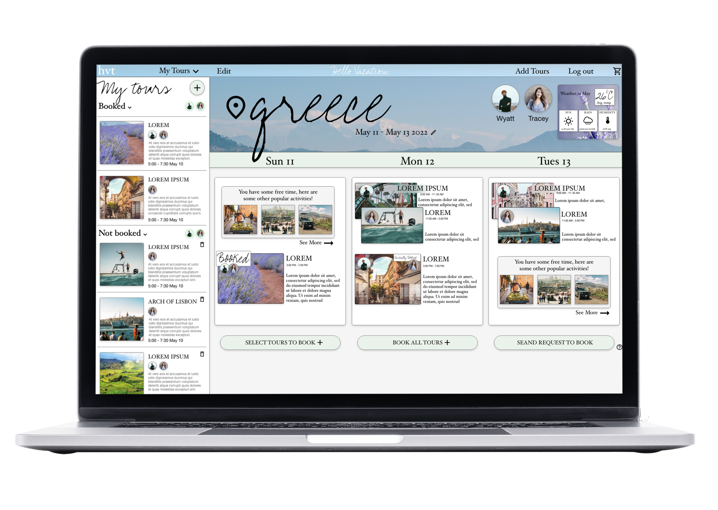
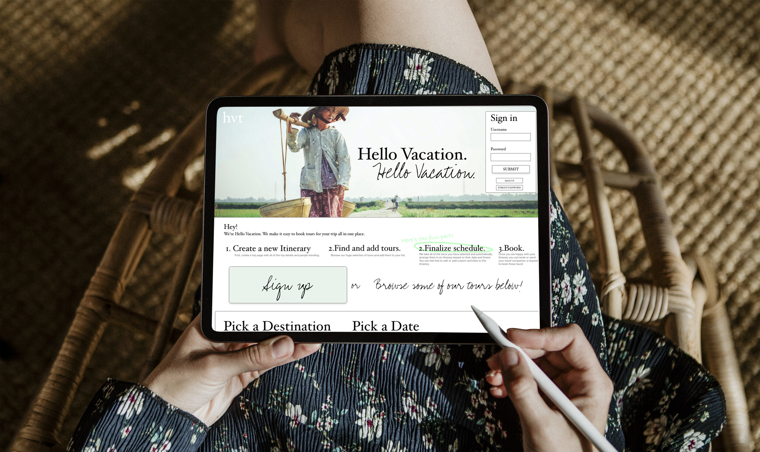
Hello Vacation Tours helps people create personalized itineraries for trips by offering a selection of tours and then arranging the ones users pick into a schedule. Users can book tours, add custom activities to their itineraries, and share these itineraries with fellow travelers.
I focused on interaction design and process automation to integrate many different features into a seemingly simple app.
Goals.
Organize and consolidate users’s vacation schedule in one place. Users should have all the information they need at a glance and not feel overwhelmed by information.
Incorporate a feature in the app to view digital tickets on the go so users don’t have to search through emails or print tickets they will have to keep track of.
Create both a mobile app and responsive website that are cohesive and complimentary across various screen sizes.

Initial research
Personas.
After conducting user interviews, I created personas to shape my app.
Jackie.
AGE: 34
EDUCATION:
Master’s Degree
HOMETOWN:
Milwaulkee, WI
FAMILY: Single with many brothers and sisters.
OCCUPATION: Counselor.
Jackie is a traveler who likes to plan family trips in advance who needs a way to view all of her and her families itineraries in an organized way because it’s hard to keep track of so much information across different sites.
Competitive Audit.
Through researching both direct and indirect competitors I found opportunities to create a successful app through the gaps in their designs.
1. Although users could view a list of tours, there was no way to view tours in a calendar mode.
2. No other app lets users collaborate with other travelers in their group.

Wireframes and lo-fi prototype
Give the people what they want.
Itinerary.
View multiple people doing different things simultaneously on the same itinerary.
Create a custom activity. All activities, from the app or not, would be consolidated in the itinerary.
Collaborate.
Share these itineraries with your fellow travelers and see it others have booked the same tours.

User Testing and Mock-ups.
Usability Study.
I conducted an unmoderated usability study with five participants in remote locations across the US. Participants took between 20 and 30 minutes to complete the study.
80% of users found the itinerary too small.
The itinerary is now expandable and each day of the itinerary has its own separate screen. At the top, all of the days of the trip are highlighted to let the user know where in the timeframe that day falls. Users can quickly swipe left or right to view different days.
100% of users did not think the difference between activity and tour was clear.
Instead of having to pick a place to see and then choose a tour, I condensed the flow so that users can go directly to choosing a tour.
Collaboration was confusing.
I included chips that let the creator designate each collaborator certain capabilities. This includes a “request to book” mode so that users can ask other users to book tours through the app. Users can make sure they book the same exact tour and do not have to worry about one person paying and the other having to reimburse them.
I also added a small help circle on the main itinerary screens to show what the request feature does.

Creating a responsive website
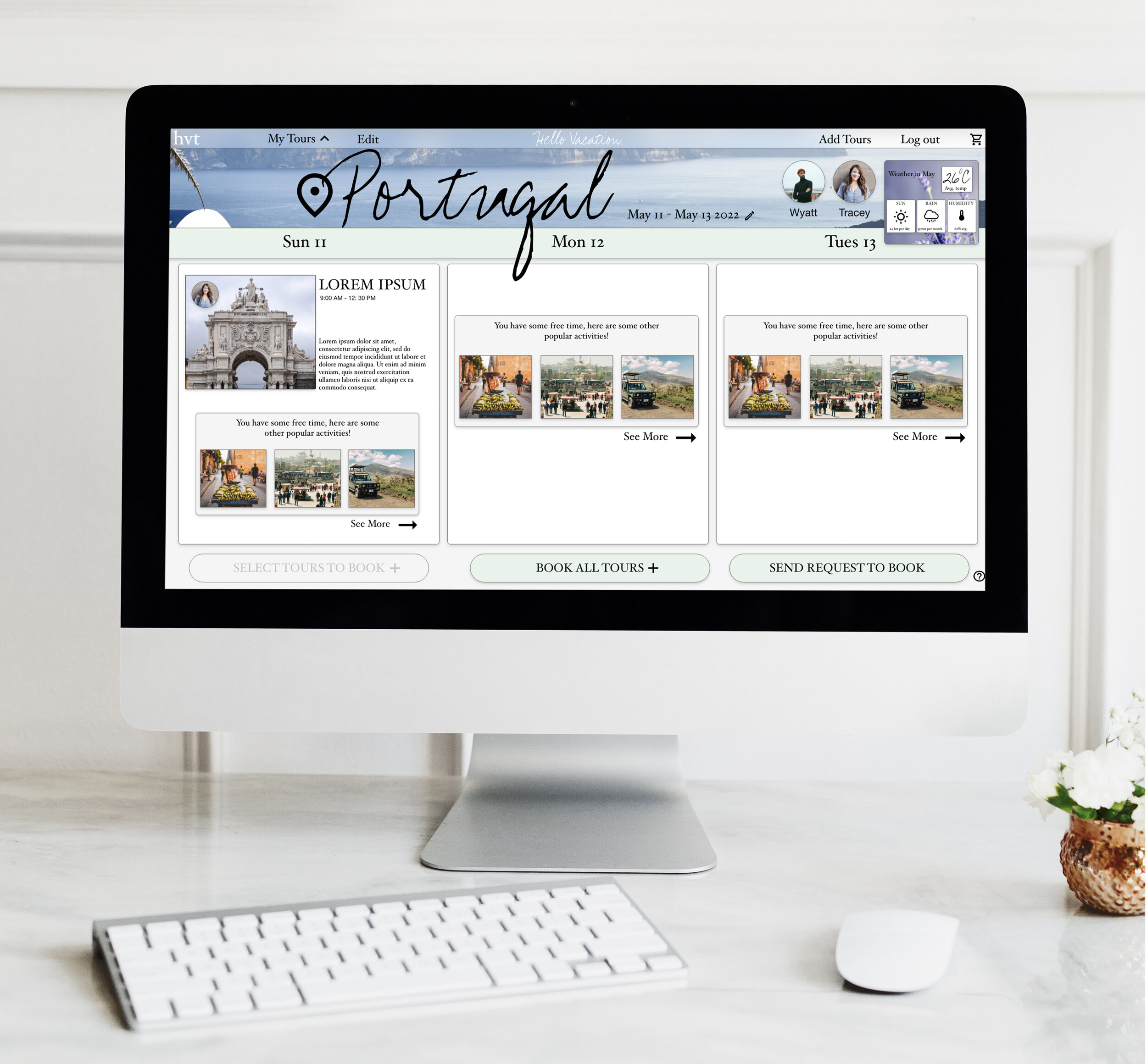
You can find the website 1920 x 1080 high-fidelity prototype here:


Assessing Goals.
Organize and consolidate.
Users have all of the information they need at a glance on the itinerary page.
Incorporate a digital ticket feature.
Feature in the app to view digital tickets on the go so users don’t have to search through emails or print tickets they will have to keep track of.
App and responsive website.
Both a mobile app and responsive website that are cohesive and complimentary across various screen sizes.
Takeaways
This was the first project in which I used the progressive enhancement technique.
I realized that I am a bit ambitious when I start a project and include much more information than I need. Even though I was supposed to keep progressively adding more information, I found myself simultaneously needing to degrade the information on the other end.
I saw how starting simple is the best strategy for this technique and to build up instead of trying to bring all of the pieces together at once.


