Role: Concept Creator, Designer, Prime Minister of Mars.
Date: December 2021
Mars-Z 82A-ZF
As of December this is still a work in progress.
You can view the mobile app prototype here and the web prototype here.
Goal: Create an informational site for people considering moving to Mars-Z.
I challenged myself to create an app that was very heavy on information, yet easily navigable on a mobile phone. I also wanted users to stay engaged and not feel overwhelmed by information.
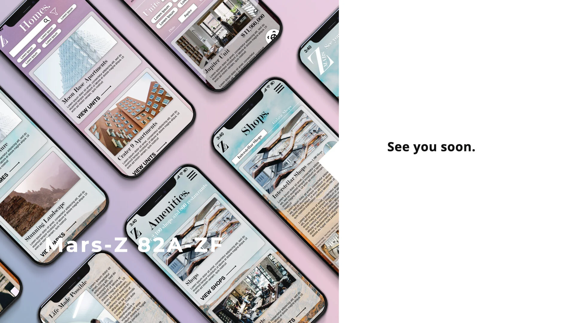
On the homepage information is sorted into broad categories, each represented on a card with a picture and small description.
Users are quickly directed to the information they are looking for.

As Little Page Re-directing as Possible.
I offered suggestions for filters that users could tap instead of opening up the filter screen.
Once the user has gone to the page of a specific building, there are different units for users to view. I chose to keep the units all on the same page by using a tab bar.
Keeping all the units within the one building page uses Gestalt principals to make users feel grounded, and not in a rabbit hole of new pages.
Brief descriptions of the two links at the top and put them in a box with a contrasting color.
The eye is drawn to the black background with white text that is separated from the other content. This signifies to the user that the information is important.
These links go to long documents. By having them clearly available, users can feel comfortable that the information is accessible, but can also scroll down to see brief summaries.
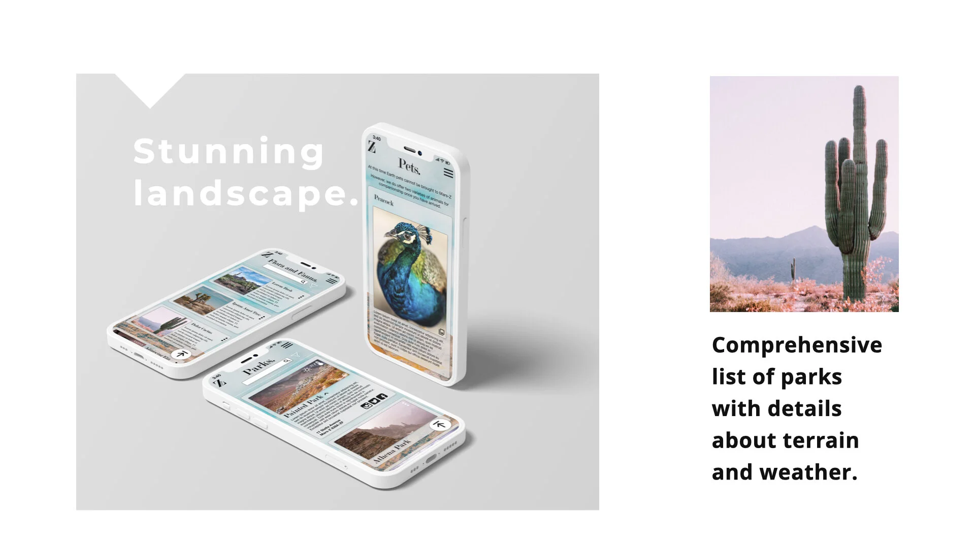
On the page for the national parks, the cards are expandable to reveal the weather (in icons) as well as social media links (also in icons).
This limits the amount of text on the page.
There is a scroll to top button which is fixed on the screen.
This way users do not have to scroll through many opened cards.
“Jump to” Section at the Top
This allows users to skip to the information they are looking for.
I did not separate this information into expandable cards because each section builds on the last, and is not its own entity.


